Back
Anton Murlykin's project
Роль: UX / UI Designer | Product DesignerProject: Media website for car blogger Sergey Zakharov
The main goal is to combine author's reviews, news, blog in one place, increase brand awareness 3axapoV and improve the perception of content.
The main goal is to combine author's reviews, news, blog in one place, increase brand awareness 3axapoV and improve the perception of content.
setting the task
Starting point/
Sergey Zakharov is an automotive commentator whose audience actively follows content on Drive2, Telegram, and Rutube. However, all publications were scattered across third-party platforms, making it difficult to control user experience, analytics, and brand development.
lack of a dedicated media space where the audience can conveniently read and watch fresh reviews.
The main business problem
Key objectives of the project:
- prepare a database for partnerships, advertising, and events.
- improve the perception of materials and audience engagement;
- increase brand awareness of "3axapoV Drive";
- create an independent media platform with a clear content structure;
Analytics and research
At the first stage, we studied the analogues and niche leaders: Drive2, Motor.ru, Avtorevyu, and Jalopnik.
We identified the following problems: complex navigation, excessive advertising, and a lack of a coherent UX pattern for media content.
We identified the following problems: complex navigation, excessive advertising, and a lack of a coherent UX pattern for media content.
- The main tasks:
- Identify pain points of readers (excessive text, visual noise, low mobile adaptability).
- Form hypotheses on how to simplify the perception of information and attention retention.
- Conduct JTBD analysis to understand what tasks the user solves when visiting the site (for example: “When I choose a car, I want a short and honest review so that I don’t waste time”).


Audience research
I segmented users and built a JTBD model:

Алексей Морозов, 39 лет
Роль: автолюбитель, активный читатель автомобильных медиа. Моя цель — получать честные и структурированные обзоры, быть в курсе новинок и находить мнение, которому можно доверять.
Подробная информация
Екатерина Литвинова, 29 лет
Роль: начинающий автолюбитель, практичный покупатель, ориентированный на мнение экспертов. Моя цель — получить понятную информацию о современных автомобилях, чтобы принять решение о покупке и не зависеть от советов дилеров.
Подробная информация
→ These scenarios gave rise to the "Reviews / News / Blog" structure

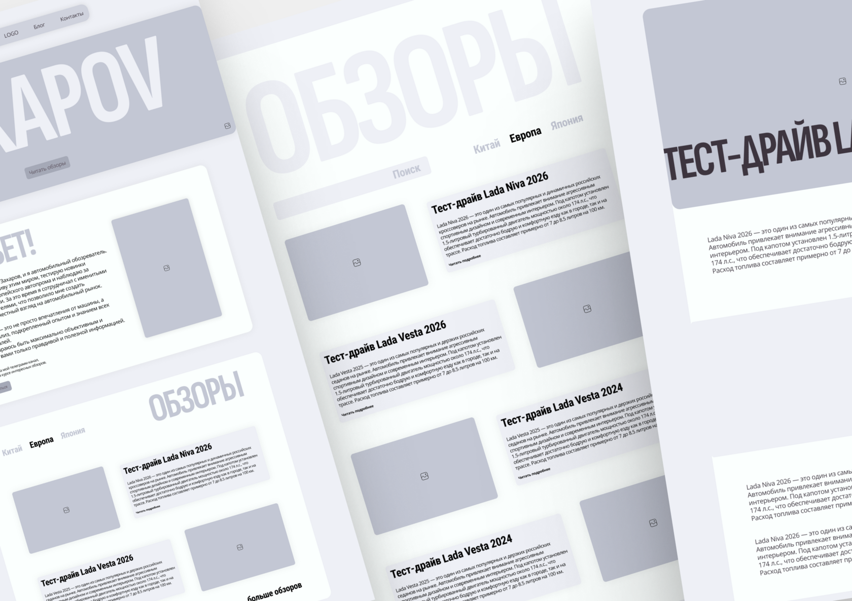
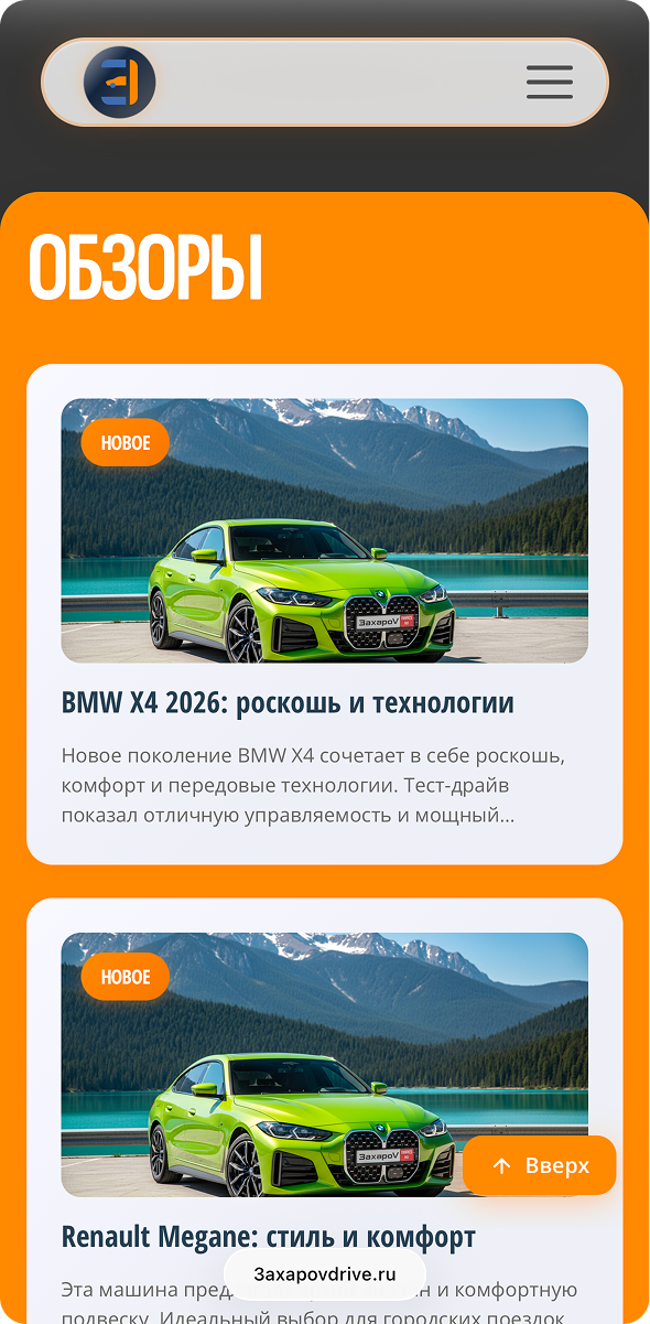
There is an idea of filtering in the "REVIEWS" section by region (Europe, China, Japan, Korea).
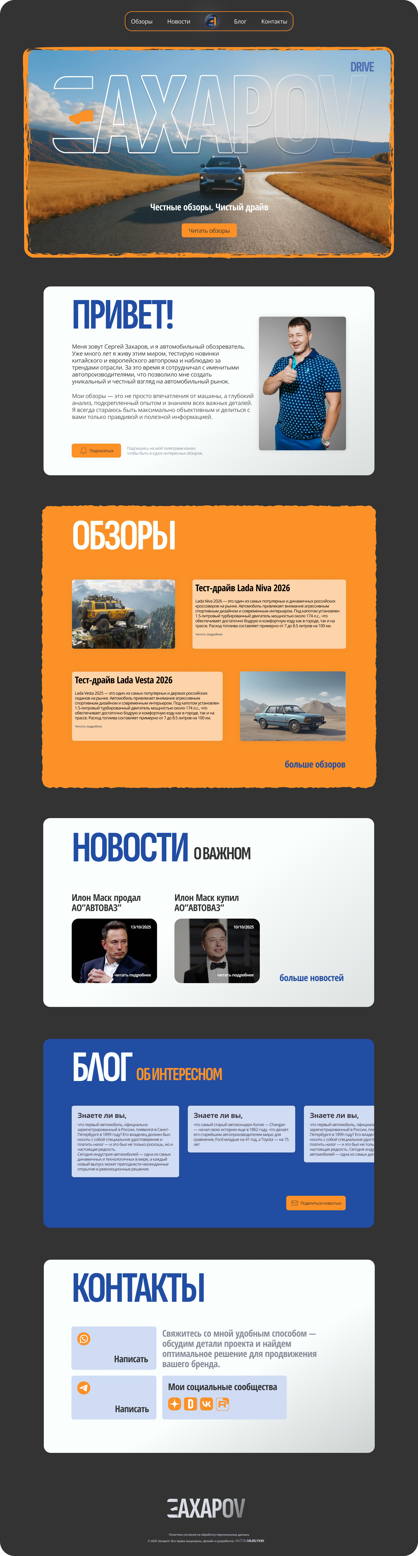
- The visual content hierarchy is based on the Content-First principle, where users can quickly access reviews and categories.
- The UX solution includes a sticky header that highlights active sections when scrolling, as well as review cards that can be filtered by country (Europe, China, Korea, and Japan).
- There are also CTA areas that allow users to navigate to new publications.
Formulation of hypotheses
Soft micro-animations and hover effects will create a dynamic, lively brand experience without overloading it.
An adaptive grid and a minimalistic interface will improve the perception of information.
A strong visual HERO-block with a recognizable logo will strengthen the brand's identity.
Structuring content into categories will increase navigational clarity and browsing depth.


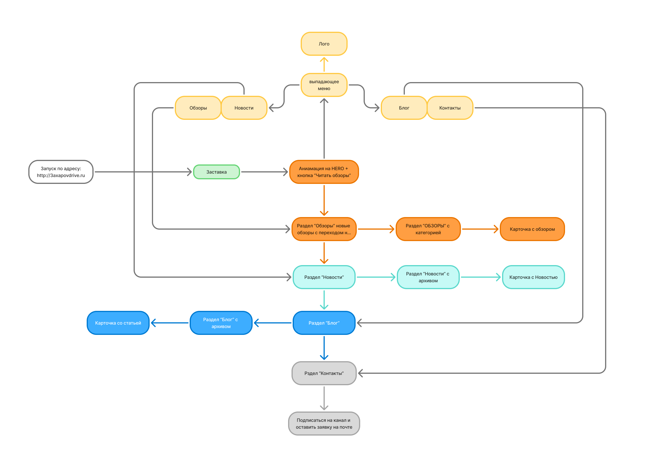
Product Architecture /
UX-logic
I created an information architecture (IA) by highlighting the main sections in different colors:
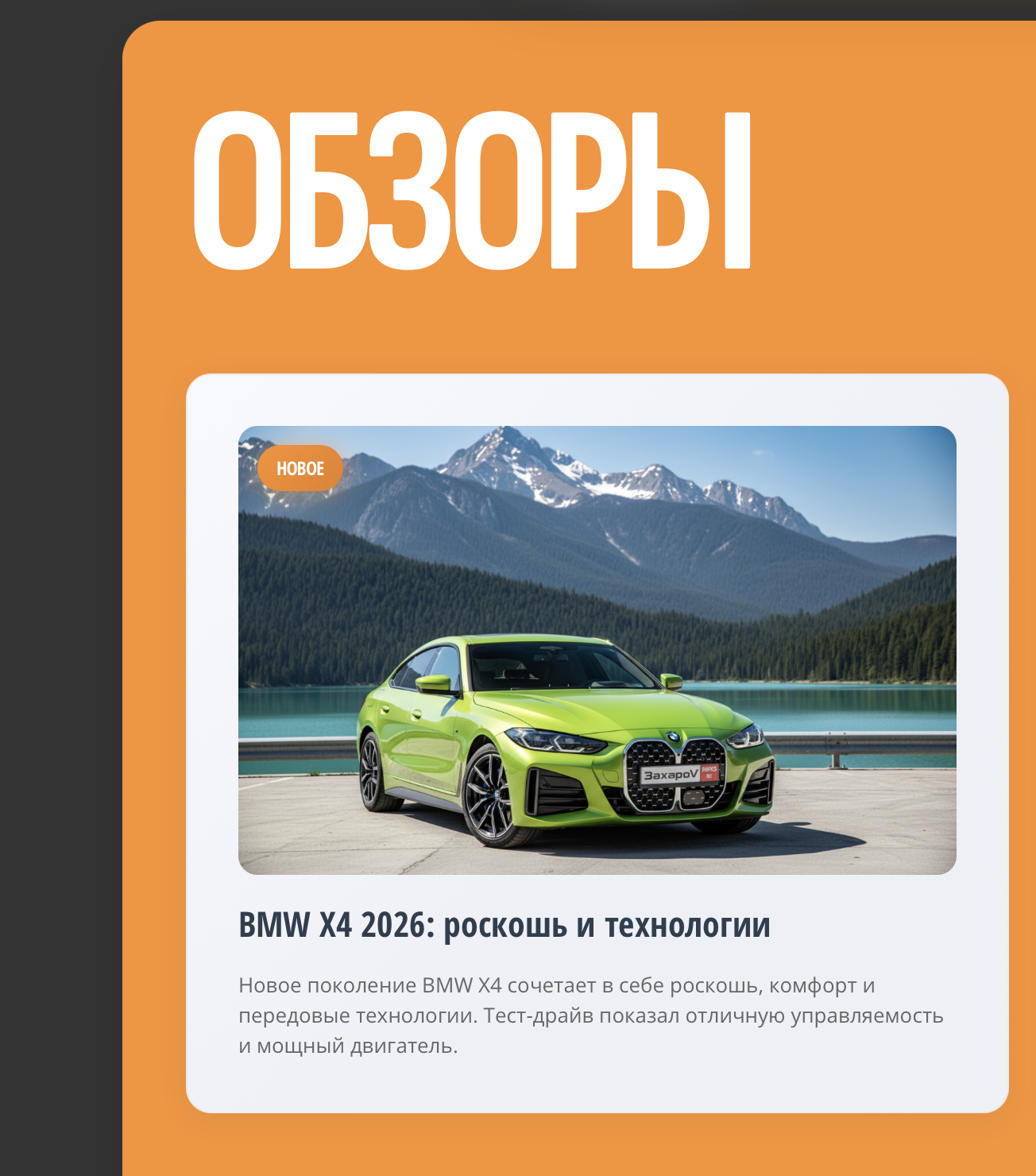
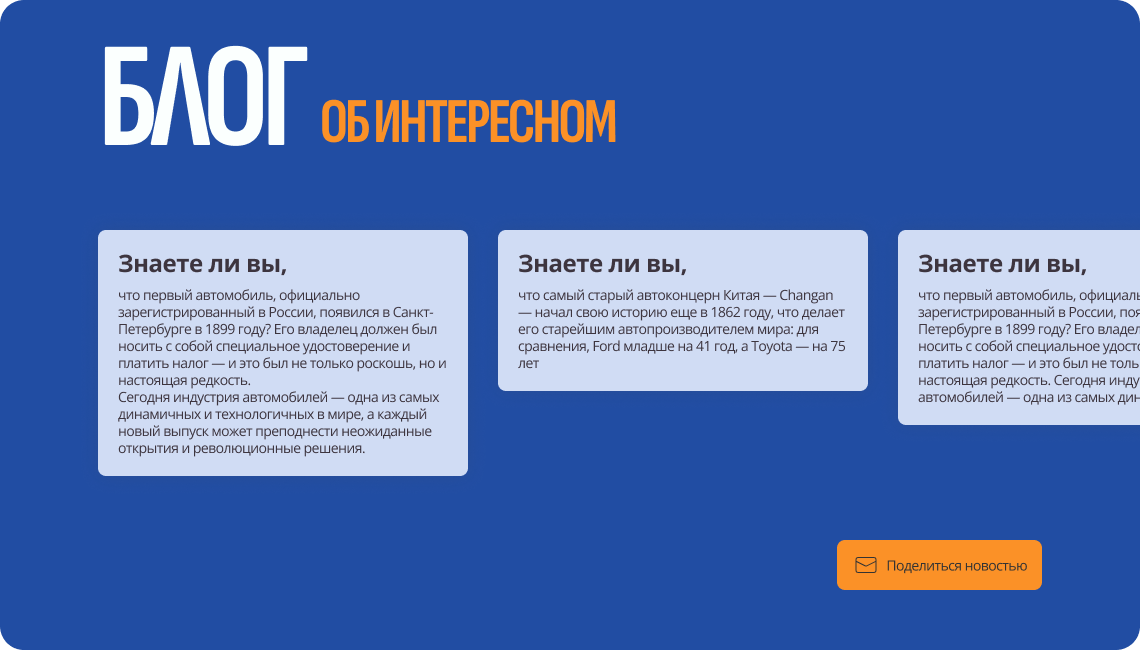
Blog - longreads, personal stories, and analytics;
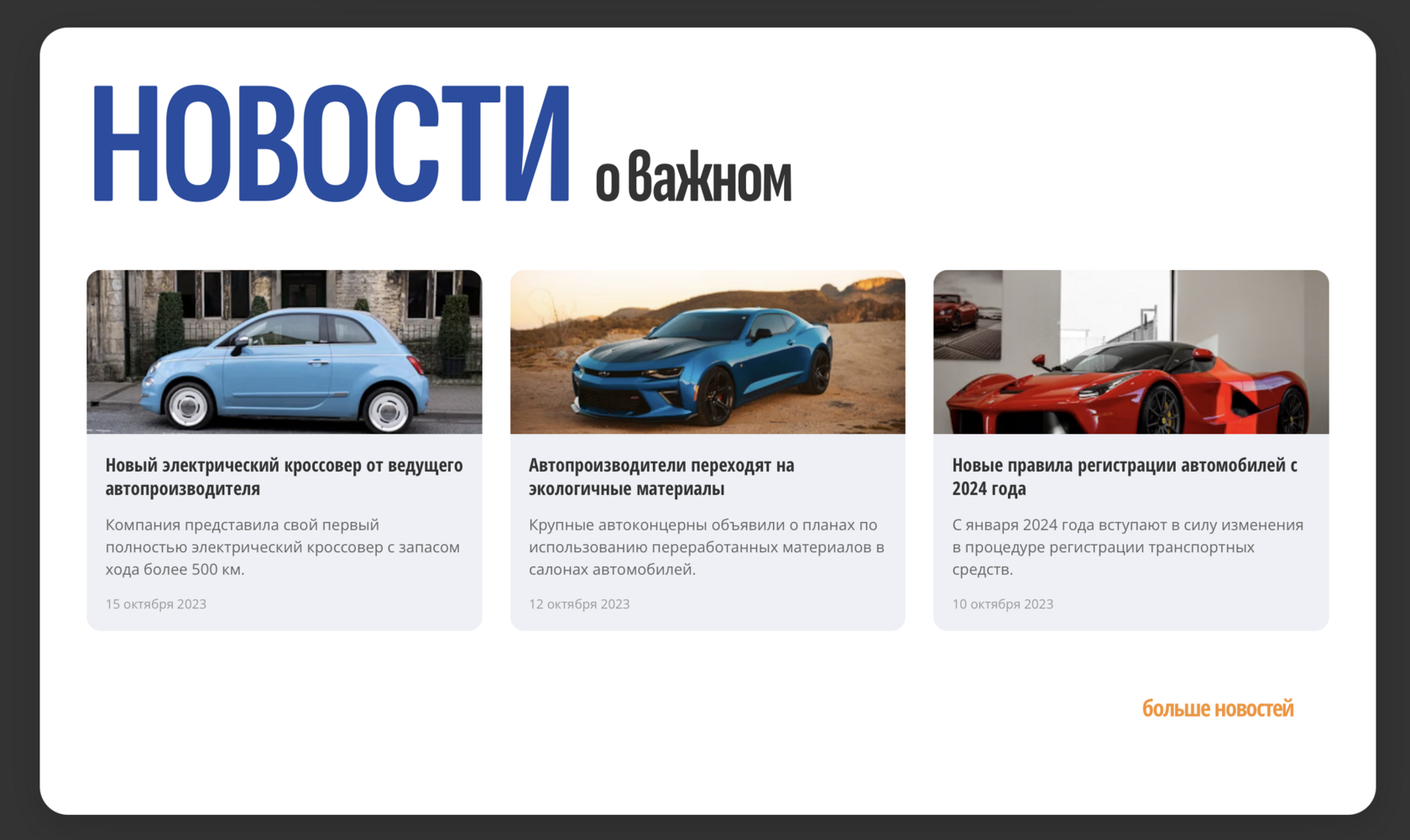
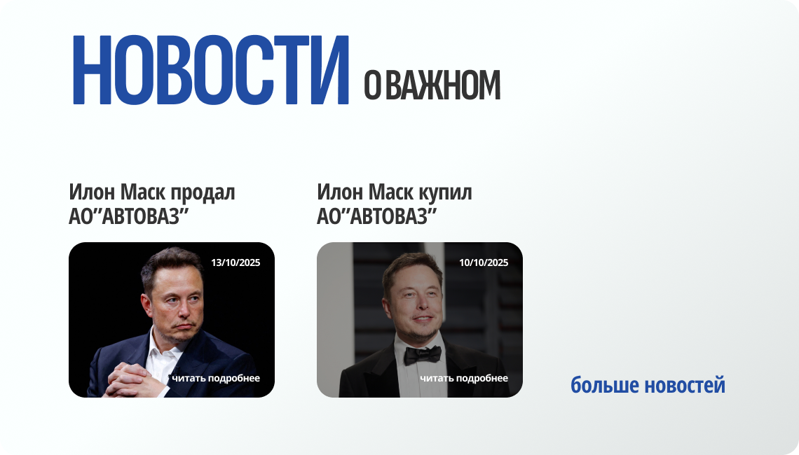
News is short articles with time markers and tags;
Reviews - filters by country when you go to a separate page with reviews.
Animated cards with reviews.
"New" tags for adding fresh content.
Animated cards with reviews.
"New" tags for adding fresh content.
- I built a user flow, including:
- the user's path from the main page to a specific review;
- the "read a news article → go to a blog" scenario;
- interaction with menus, scrolling, and active states.
Prototyping/
UX testing
- Created a wireframe in Figma, with a focus on UX patterns: readability, visual content priority, well-aligned spacing and grid (12-column, gutter 20px), checked the structure and clickability.
- The main focus is on:
- text readability (contrast, line length, indentation);
- category perception speed;
- adaptability for tablets and mobile screens.
Visual language
The color palette is based on the customer's corporate colors, which were provided as the main colors: blue and orange. Together with the customer, we modified their shades to match current trends and integrate them harmoniously into the design system.
Цветовая палитра
#214DA3
Основной фирменный
Глубокий синий цвет символизирует технологичность, надежность и профессионализм. Вызывает доверие и ассоциируется со стабильностью в решениях.
#FB9127
Акцентный
Энергичный оранжевый передает динамику, креативность и инновации. Привлекает внимание к ключевым элементам.
Typography


for the main text (readability and ease)
for headings (narrow, powerful, dynamic)
- Header with active section highlighting on scroll (scroll-spy);
- Material cards with clear information hierarchy;
- CTA buttons and forms in a single rhythm of indentation;
- Micro-animations of SVG for the logo and interactives.
Created unified components:
Development and integration
The Tilda and Zero Block platform was chosen for implementation as the optimal solution for the MVP release.
A unique code was written for the following blocks: HERO, Reviews section, News section, and Blog section
A unique code was written for the following blocks: HERO, Reviews section, News section, and Blog section

- UI-animations and visual effects
- Pure CSS animations without third-party libraries are used — fade-in, blur-reveal, slide-in.
- This ensures minimal page weight and high performance.
- The HERO block features a smooth appearance of the logo and title with a time delay, creating a cinematic feel for the introduction.
- Adaptive system for all devices
- Each section has custom media-queries for three breakpoints: Desktop (≥1200 px), Tablet (≥768 px), and Mobile (≤480 px).
- The grid is rearranged without losing its proportions, and typography and buttons are scaled smoothly, without the "steps" of standard blocks.

Testing and optimization
I conducted a series of checks in three areas:
- UX quality: transition logic, readability, focus states, clickable areas ≥ 44px.
- Performance: image optimization and caching.
- SEO: semantic markup, OG tags, correct H1-H3, and clear URLs.
Results
The goal was achieved: a modern, recognizable media platform was created that reflects the author's personality, preserving the brand's color and providing a space for brand expansion.
the website became the main source for partner publications
CTR of review cards
full version of the website
the viewing depth increased by:
repeat sessions
0%
0%
0%
Desktop

