The business problem:
- Maira's business had reached its growth ceiling, limited by the capabilities of social media. The lack of a centralized platform led to two key challenges:
- Inefficient conversion: The audience attracted from social media "cooled down" as they manually researched the details of the services and searched for free time, resulting in a high churn rate.
- Low brand value: The fragmented presentation of information made it difficult to create a premium image and justify the cost of services.
Decision:
The project was implemented as a single-page website
on the Tilda platform using Zero Blocks.
A unique visual system was developed
with an emphasis on typography, minimalism, and a color palette that reflects the aesthetics of the beauty industry.
on the Tilda platform using Zero Blocks.
A unique visual system was developed
with an emphasis on typography, minimalism, and a color palette that reflects the aesthetics of the beauty industry.
- Develop a UX/UI design focused on a female audience aged 20-40
- Emphasize the master's individual style through visual identity
- Design the website structure and user scenario to increase conversion
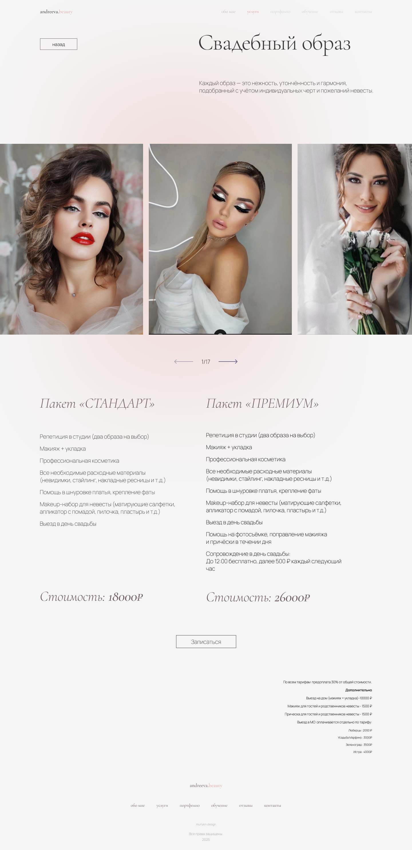
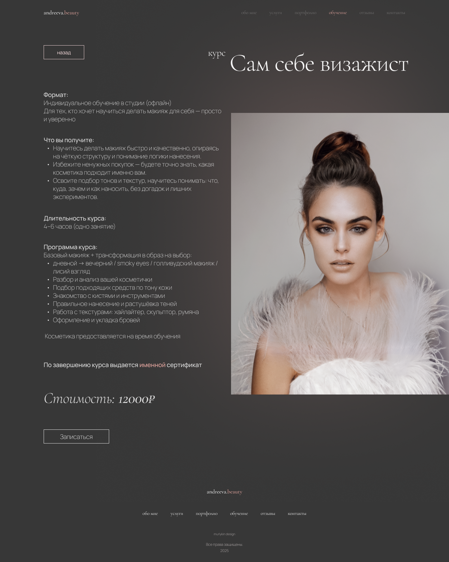
- Visualize services, portfolio, and training in the form of clear cards
- Integrate a feedback form and CTA buttons for recording
- Implement the layout on the Tilda platform with mobile adaptation
Project objective:
Develop a modern, visually polished, and functional one-page portfolio website for stylist-make-up artist Maira Andreeva with a focus on a product approach.
The design should not only reflect the premium and professionalism of the master, but also be based on the analytics of user scenarios: simplify the customer journey, increase trust and conversion, and systemically present services and training through a well-thought-out UX and visual hierarchy of UI.
The design should not only reflect the premium and professionalism of the master, but also be based on the analytics of user scenarios: simplify the customer journey, increase trust and conversion, and systemically present services and training through a well-thought-out UX and visual hierarchy of UI.


stages of work:
the color palette:
The color palette combines delicate and contrasting shades that convey aesthetics and premiumness:
wireframe:
At this stage, the logical structure of the website was built. Each block was designed with user convenience in mind: accents on key actions, clear hierarchy of information, and a clear user path.
This helped to plan the visual rhythm in advance and avoid interface overload at the design stage.
This helped to plan the visual rhythm in advance and avoid interface overload at the design stage.


TYPOGRAPHY:
Two typefaces were chosen for the project: the elegant and sophisticated Cormorant Garamond typeface, which emphasizes the brand's aesthetic and creates a premium feel.
The second typeface, Manrope, is used to emphasize accents.
The second typeface, Manrope, is used to emphasize accents.


Desktop :
A full-fledged desktop version of the site is designed
with convenient navigation, emphasis on visual content and easy perception.
The project includes several separate pages: the main page, pages with services, a gallery of works and a page
with training.
with convenient navigation, emphasis on visual content and easy perception.
The project includes several separate pages: the main page, pages with services, a gallery of works and a page
with training.
Result:
The website has a clear structure and visual logic.
User engagement has increased due to the focus on photos and user-friendly navigation. + 20% of new customers.
The user's path to booking a service or training has been simplified.
A foundation has been laid for further promotion on social media and through advertising.
User engagement has increased due to the focus on photos and user-friendly navigation. + 20% of new customers.
The user's path to booking a service or training has been simplified.
A foundation has been laid for further promotion on social media and through advertising.
What was done:
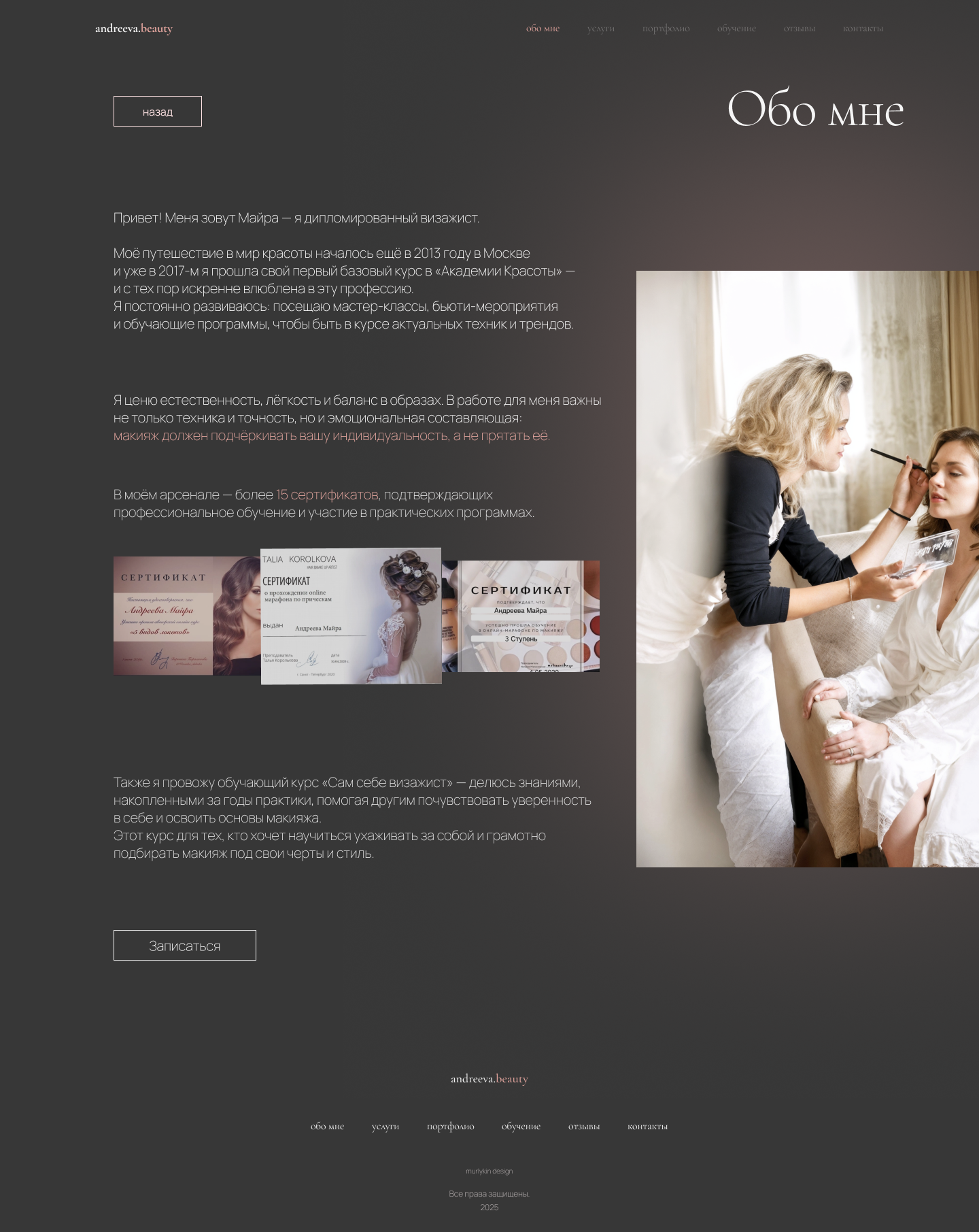
- Created naming and logo "MAIRAS.BEAUTY" in the style of Cormorant Garamond
- The first screen (Hero-block) forms an emotional connection. Blocks "Services" and "Portfolio" work with rational arguments and remove objections. Blocks "Reviews" and "Contacts" are the final push to the target action - recording".
- Written unique texts for each section, reflecting the values and tone of voice of the brand
- Collected and decorated service cards with icons and clear hierarchy
- The "Training" block design was thought out with a detailed description of the course.
- All blocks were adapted for mobile devices.
- The website was created using Tilda, including microanimations, visual accents, forms, and CTAs.
- A UX/UI audit was conducted after the launch, and final adjustments were made.

